Welcome to Our Rebrand
Today we unveiled Aaptiv’s new branding—a strategic rethink of our brand expression and identity designed not just to elevate the look and feel of the Aaptiv brand, but also, to bring the company’s visual representation to a level that demonstrates the values and vibrancy of our fast-growing community.
To understand what we were aiming for with this rebrand, it’s important to know that for us, branding is not just our opinion on how things look and sound. It’s not just about making things pretty or winning design awards. To us, branding is the means by which we tell the world what Aaptiv stands for.
This is the story of how the Aaptiv rebrand came to life and what this new look represents.
Deciding to Make a Change
The process for the rebrand began in fall 2017. Since launching the company in 2015, we have been humbled to watch the lightning speed of growth. In order to continue this upward trajectory into 2018, we had our work cut out for us, but, none of us were thinking “we have to redo our logo and the brand colors.” After all, why change what’s working? However, it didn’t take long to realize that the immense energy, depth of values, and strength of purpose that existed between the employees and Aaptiv members was a gem hidden from most.
The world needed to see what we were seeing on a day-to-day basis—a group of high caliber, dedicated trainers, a highly supportive community of members, and a business that emphasizes strength-of-mind and purpose over vanity and appearance. This was a tale worth telling and thus we set out to rethink how we might expose the stories of success and failure, of persistence and perseverance, of heart and soul that make up Aaptiv.
Assembling a Dream Team
Our first task was to build a team that could deliver such expression without just thinking of it as a redesign of a logo. To lead the charge we hired Matt Angorn, then head of brand at Audible, as our VP of Brand & Creative. If there’s someone who can make magic happen, it’s him. With Matt, and two rock-stars, Bethany Cantor and Shauntay Pitts who are our resident experts in community and video respectively, we had an internal crew assembled to take on this task. Next, we joined forces with the design pros at Red Antler and set out on a journey to rethink Aaptiv.
As mentioned before, to the Aaptiv team, branding is so much more than pretty colors and symbols. In order to show the world the values and ideas we represent we had to dig deep and take a stand on who we are, who we are not, and what we believe as a brand. To start, we made a list of both.
Who we are not:
- We are not just another weight loss app.
- We are not about gimmicks or trendy flash-in-the pan fitness fads.
- We are not just about six-pack abs or bikini-body workouts.
- We are not another alternative to the gym.
With our list of “who we are not” thinned down to a core set, it was time to define who we are. To understand that ourselves, we needed to go through a beliefs exercise. The outcome of that was a few simple statements:
What we believe:
- We believe that everyone—not just the few who can afford a personal trainer—deserves access to professional fitness instruction.
- We believe that everyone should be able to achieve their healthiest life—to some that means running their first 5K race, to others it’s having enough stamina to play with their kids, and to yet others it’s about losing weight or achieving a toned, strengthened body. Whatever your goal, we will stand by you to get you there.
- We believe that people’s fitness goals should not be minimized to thigh-gaps, bikini bodies, or six-packs. The focus on vanity is an obsolete idea, yet it’s prevalent in all fitness businesses. You don’t have to look like a supermodel to run a first 5k. We stand for more than that.
- We believe that the fitness industry is fundamentally broken—its focus on isolated, quick success programs or live classes at impossible hours in the middle of the day misses the idea that as individuals we will go through different life stages. Some of us will get busy at work, some will get pregnant, some will gain weight, some will get out of shape, some will get injured, and all of us will get old in ways that change our needs over time. Yet, no one has built a product that users can stick with through thick and thin with complete confidence that they’ll achieve their healthiest lives
This values exercise brought us to the point where we could define who we are.

Who we are:
- We are the brand that stands for strength in mind and body.
- We are respectful of your purpose.
- We are your motivation, your coach, your friend, and your support.
- We are experts in fitness and health at every phase of your life.
- We are the only brand that does not ask you to weigh yourself, measure yourself, or take before/after pictures just to prove that the product works.
- We are just getting started.
Doing the Work
This part was tough. On one hand, we are different from others in remarkable ways: we have incredible music that we license and use in our classes (no stock or elevator music allowed). Crucially, we don’t just place a time-based playlist on our classes—the music is carefully selected to match your level of effort—and, each workout is specifically designed to motivate and inspire you during those key times in the workout that are most challenging.
In a more general sense, we are an entirely audio based product which in-and-of-itself is unique in an industry where most products are video based. So many positive attributes and values—the question we faced was: To which attribute do we anchor the strategy of this rebrand? This was a grueling creative exercise. After all, strategy is more about what you decide not to do, than what you actually do. We had long discussions and frequent, short-lived, moments of discovery that felt like we’d found the perfect direction. After much exploration of music, audio, motivation, freshness of content, etc. we found the answer at the very core of our product.
The “Spark”
In the end the answer was sitting right in front of us. It came down to the moment when someone hits play and the trainer and member meet in a virtual private session—when the music is just right, the instruction is perfectly clear, the class is invigorating, and the trainer knows just what to say to push you forward—the moment that allows you to tune out everything and make noticeable progress.
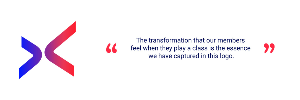
While it took many twists and turns (we even had headphones in one of the wordmarks, no joke!) the first time we saw this logo we were hooked. It had a pull and energy. This moment was the spark. Hence our logo—which we now call “The Spark”—was born.

The Spark is many things—it’s a representation of the two A’s in the word Aaptiv. The two A’s have forever been symbolic of the Aaptiv member and the trainer. The transformation that our members feel when they play a class is the essence we have captured in this logo.
The colors in the logo are also very deliberate. Like the logo, they mean many things. At one level, our gradient shows transformation and energy over time and at another level the individual colors used showcase the calm moods of meditation and yoga and the intense moods of cardio and strength training. In this, we found our balance.
Bringing the Trainers to the Forefront
Once we had our logo and colors locked down, we knew the next crucial step was to lead with our trainers—the incredibly humble and talented group of people who are truly changing lives of millions of people.
In this rebrand, you will see them proudly wearing Aaptiv attire and hear a lot more about their stories, their talents, and their work. This is, by far, the best gathering of personal training talent, anywhere. Period. We knew their stories were worth telling so we hired a biographer to work with each of our trainers so we can bring their lives to you. More to come on this over time.
Looking Forward
The collective focus and months of hard work from the team at Aaptiv and Red Antler have finally come to an exciting conclusion and I am very proud of what this team has accomplished. While our brand will evolve multiple times over its lifetime, this is a key milestone for us that moves Aaptiv forward in a positive way.
Armed with a renewed sense of purpose, a new logo, a new wordmark, and an updated look and feel, we are ready to bring Aaptiv to the larger universe. While it’s impossible to name all the people within the company and externally who helped get us to this point, this rebrand was truly the work of many devoted men and women who share one single resolve—to help you live a healthier life and treat you with dignity while doing so.
From all of us at Aaptiv, we hope that you will appreciate the hard work and thought that went into bringing this idea to life and come to love this young and growing brand, as much as we all do.
Cheers-
On behalf of Team Aaptiv,
Arjun Kapur
